Design
As primarily a web journalist, I don't do much traditional magazine or yearbook design. Instead, I have incorporated multimedia, art, and other visual elements that are optimized for web into my stories.
WSS website redesign
A project that I, alongside Design Editor Anna Greenlee, undertook this year was redesigning the website. We started brainstorming over the summer and made a list of things that we would like to change.
Anna did a majority of the actual designing, because SNO doesn’t allow for two people to work at once, and I didn’t want to delete her work. She is also an amazing designer, so I let her execute her vision and advised along the way.
We changed:
-
Games
-
As entertainment editor, Anna Greenlee has taken charge of making our website a games page. She uses PuzzleMe to create a variety of games that she uploads every weekday. We have gotten a lot of positive feedback, especially from Foundations of Journalism students, on adding games and have found it increases engagement.
-
-
Marquee speed
-
We have a Marquee in the header of our website with the events of the week (I update these every Monday). We decreased speed to increase readability.
-
-
Added green
-
A critique we often received was the lack of color on our website. In our redesign, we incorporated green in the marquee, divider lines and footer of our website.
-

-
Changed section pages
-
We had many categories in SNO that were not serving any purpose so we incorporated some of the subcategories onto the section pages.
-
add screenshot of politics?
-
-
Added more to the sidebars
-
When our X embed stopped working, our main sidebar only included a staff profile. After the redesign, our main sidebar includes trending stories, newsletter subscription, West High Weekly, our print magazine, Instagram, and games page. We also customized the sports sidebar to include our No Cap Recap sports podcast and recent sports results widget.
-
-
Standardized featured image sizes to 3x2
-
We more seriously enforced using 3x2 featured images to avoid strange cropping on the homepage and so images in the related stories widget are all the same size.
-
-
Sports center
-
We added SNO's sports center element to incorporate upcoming sporting events and recent results into our website.
-
Anna and I organized all our plans on a Google Doc.
Other web design
While redesigning our website has been my biggest design project, I also have incorporated other design elements into my stories for engagement and artistry.
Infographics
Infographics are a great way to present information in a different and more engaging way — especially numbers. Here are some of my favorite infographics I have created.

Students with disabilities data breakdown (left)
This graphic was included in an article I wrote about students with intellectual disabilities called "Substantially limited". While researching statistics, I found a study that contained a variety of data about K-12 students with disabilities. I built this infographic starting with a Canva template that I made my own and adapted to the data I was working with. This graphic won first place infographic in IHSPA's 2025 spring contest.
What is SNAP? (above)
When I was reporting on the Trump Administration threatening on shutting down snap funding, I realized I didn’t have that great of an understanding of how snap worked. So I created an infographic that covered what the program was and how it functioned instead of writing out lists and paragraphs in my article.
Funnel deadline legislation update (left)
Sophomore year, I covered the bills that were still being debated in the Iowa legislature after what is known as a funnel deadline eliminated a large amount of proposed legislation. I decided to put the bills into an infographic instead of writing them out as separate paragraphs, because I figured something more visual would be easier to understand. This story won first place for multimedia news story in IHSPAs 2024 spring contest.
Tools
-
-
A great resource for almost anything design. Is beginner-friendly, contains a variety of royalty-free design elements and has a variety of features.
-
-
-
My go-to for creating infographics!
-
-
-
Great for creating graphics and adding extra information without it getting visually overwhelming.
-
-
-
When I don't know what colors I want to use, I use Coolors's color generator.
-
Infoboxes
I used an infobox in my story "A new vision for elementary education" when I covered the ICCSD's proposal for restructuring elementary education. This allowed me to present information in a way that was concise and visual, along with breaking up my text. This story won second place multimedia news story in IHSPA's 2025 spring contest.


This is just a slider gallery of screenshots of the infobox. To see the infobox, view the article here.
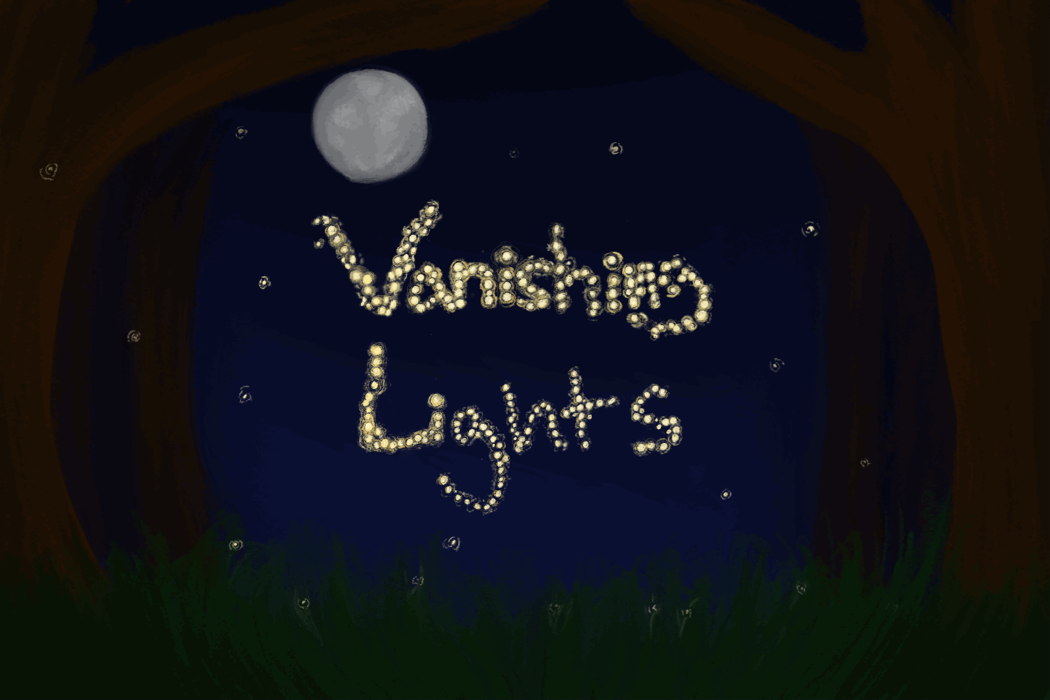
Art
Two WSS online staffers primarily create art. We incorporate art in a variety of ways, mainly our website header and featured images. Though I don't usually make art, I've done a few art projects for WSS. My favorite was a featured image I drew and animated for a story about the disappearance of fireflies. I had to learn to navigate the animation feature of Procreate and I'm still mainly used to physical art and not digital art which was an adjustment. Though it was a lot of effort, I was grateful to try something new.